Apple’s iOS 26 is bringing something completely different to your iPhone – and honestly, it’s going to be quite the adjustment. The new “Liquid Glass” design isn’t just a small tweak to the interface you know and love. It’s a complete visual overhaul that makes your phone feel like you’re looking through actual glass.
If you’ve been wondering what all the buzz is about, you’re in the right place. Let’s dive into everything this major update brings to your daily iPhone experience.
What Exactly Is Liquid Glass Design?
Think of Liquid Glass as Apple’s way of making your iPhone screen feel more like you’re looking through a window rather than at a solid surface. This design language draws inspiration from Apple’s Vision OS, which makes sense when you think about it – both are trying to create that seamless, transparent feeling.
The whole concept revolves around transparency and depth. Instead of the solid, opaque elements we’re used to seeing on our phones, everything becomes more see-through and layered. It’s like Apple took the idea of frosted glass and decided to make it interactive.
But here’s the thing – this isn’t just about making things pretty. Apple claims this approach helps reduce visual clutter and makes your phone feel more intuitive to use. Whether that’s actually true in practice remains to be seen.
Your Home Screen Gets a Major Makeover
The “All Clear” Mode Changes Everything
The most dramatic change happens when you activate something called “All Clear” mode. This feature makes your app icons and widgets significantly more transparent – so much so that you can clearly see your wallpaper through them.
It’s definitely striking when you first see it, but there’s a catch. Many people testing the developer version have reported that this transparency can make it harder to read app names and see icon details clearly. The good news? Apple has included options to dial back the transparency if it becomes too much.
If you decide the full transparent look isn’t for you, turning off All Clear mode brings things back to something much more familiar. In that case, the main difference you’ll notice is a more transparent dock at the bottom of your screen.
Icon Changes You’ll Actually Notice
Beyond the transparency effects, Apple has made some practical changes too. Icons are slightly larger across the board, which should make them easier to tap accurately. Some of Apple’s own app icons have gotten subtle updates – the Settings app has different shading, while the Camera app received a complete redesign.
These changes might seem small, but they add up to make the overall experience feel fresh without being completely alien.
Control Center: Subtle But Important Updates
The Control Center keeps most of its familiar layout, but the transparency changes here are quite noticeable. Instead of the slightly gray-tinted background we’re used to, you can now see your home screen or wallpaper much more clearly behind the controls.
This creates a more unified visual experience, but it can sometimes make the control labels harder to read depending on your wallpaper. Again, the Reduce Transparency setting can help if this becomes an issue for you.
The functionality remains exactly the same – it’s just wrapped in this new glass-like appearance that either feels modern and sleek or distractingly transparent, depending on your perspective.
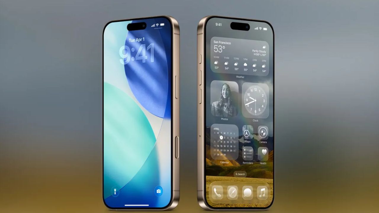
Lock Screen: Where Liquid Glass Really Shines
Dynamic Clock That Adapts to You
Your lock screen probably gets the most dramatic transformation in iOS 26. The clock is now much more stylized and actually changes size based on what’s happening. If you have a busy wallpaper, the clock adjusts. Got a lot of notifications? The clock adapts to make room.
This dynamic behavior makes the lock screen feel more alive and responsive to your actual usage patterns rather than being a static display.
New Visual Effects That Feel Premium
The transparency effects are most noticeable on the lock screen, with notifications and shortcuts taking on that glass-like appearance. Apple has also switched to white text in many places, which provides better contrast against varied backgrounds.
The flashlight and camera shortcuts now have a subtle 3D highlight effect that makes them feel more tactile. Even the unlock animation has changed – instead of a simple slide, it now feels like you’re moving a pane of glass out of the way.
Smart Features That Work Behind the Scenes
Dynamic Tab Bars That Get Out of Your Way
One of the more practical improvements in iOS 26 is the introduction of dynamic tab bars in apps. These bars change based on what you’re doing – they might shrink when you’re scrolling through content and expand when you need to take an action.
The idea is to give you more screen real estate when you don’t need the controls while keeping them easily accessible when you do. It’s the kind of smart interface design that you might not notice immediately but could improve your daily experience.
Colors That Match Your Content
iOS 26 takes the adaptive color feature that existed in iOS 18 and cranks it up significantly. While the previous version could only shift between gray and white, the new system can adapt to virtually any color in your background.
This means as you scroll through photos, browse apps, or switch between different screens, the interface elements subtly shift to complement what you’re looking at. It’s a small detail that contributes to that unified, glass-like feeling Apple is going for.
Should You Try the Public Beta?
Apple typically releases public betas in late July, and this year should be no different. However, there are some important things to consider before jumping in.
First, beta software is inherently unstable. You might experience app crashes, battery drain, or features that don’t work properly. If your iPhone is your primary device – and let’s be honest, it probably is – you might want to wait for the final release.
Second, the Liquid Glass design has been evolving significantly between beta versions. Each update has brought improvements to readability and usability based on user feedback. The public beta will likely include many of these refinements, but it’s still a work in progress.
When Can You Get the Final Version?
If you decide to wait for the polished experience, Apple typically releases major iOS updates in mid-September. This timing coincides with new iPhone announcements and gives Apple time to incorporate feedback from the beta testing period.
The final version will likely look quite different from what we’re seeing now in the developer betas. Apple has a history of making significant changes based on user feedback, and Liquid Glass has certainly generated plenty of opinions.
The Bottom Line on iOS 26
Liquid Glass represents Apple’s boldest interface change in years. Whether you’ll love it or find it distracting largely depends on your personal preferences and how you use your phone.
The transparency effects and dynamic elements certainly make iOS feel more modern and visually striking. However, the potential readability issues and dramatic visual changes mean this update might take some getting used to.
If you’re curious but cautious, waiting for the final release is probably your best bet. By then, Apple will have refined the rough edges and addressed the most common complaints from beta testers.